2022年了,还是得学圣杯布局与双飞翼布局
三列布局的其他实现
定义:三栏布局一般指的是页面中一共有三栏,左右两栏宽度固定,中间自适应的布局
这里先介绍几种也是比较常用的,并且比较容易理解的三列布局实现方法:
绝对定位
利用绝对定位,左右两栏设置为绝对定位,中间设置对应方向大小的margin的值。
.outer {
  position: relative;
  height: 100px;
}

.left {
  position: absolute;
  width: 100px;
  height: 100px;
  background: tomato;
}

.right {
  position: absolute;
  top: 0;
  right: 0;
  width: 200px;
  height: 100px;
  background: gold;
}

.center {
  margin-left: 100px;
  margin-right: 200px;
  height: 100px;
  background: lightgreen;
}
flex布局
这是比较方便的一种方法了,不过存在兼容性问题,这里利用flex布局,左右两栏设置固定大小,中间一栏设置为flex:1。
.outer {
  display: flex;
  height: 100px;
}

.left {
  width: 100px;
  background: tomato;
}

.right {
  width: 100px;
  background: gold;
}

.center {
  flex: 1;
  background: lightgreen;
}
浮动布局
利用浮动,左右两栏设置固定大小,并设置对应方向的浮动。中间一栏设置左右两个方向的margin值,注意这种方式**,中间一栏必须放到最后:**
.outer {
  height: 100px;
}

.left {
  float: left;
  width: 100px;
  height: 100px;
  background: tomato;
}

.right {
  float: right;
  width: 200px;
  height: 100px;
  background: gold;
}

.center {
  height: 100px;
  margin-left: 100px;
  margin-right: 200px;
  background: lightgreen;
}
圣杯布局
首先为什么需要这个布局:
flex布局的缺点是可能存在兼容性问题,而上方的浮动布局肯定是不存在这个问题的,那么它的缺点是什么呢?答案上面已经阐述了:中间一栏必须放到最后。这个会导致一个问题,在页面加载这个容器的时候,正文却是最后加载的,影响体验。而圣杯布局以及接下的双飞翼布局正文(center标签)会放在容器里的最前面。
如何实现
利用浮动和负边距来实现。父级元素设置左右的 padding,三列均设置向左浮动,中间一列放在最前面,宽度设置为父级元素的宽度,因此后面两列都被挤到了下一行,通过设置 margin 负值将其移动到上一行,再利用相对定位,定位到两边。
上面这句话是整个布局的实现过程,如果不理解,接下来将一步步实现:
margin负边距有什么用
- 负margin值可以使浮动元素重叠
复习一下浮动的工作原理:
- 浮动元素脱离文档流,不占据空间(引起“高度塌陷”现象)
- 浮动元素碰到包含它的边框或者其他浮动元素的边框停留
所以这里的margin负值就是覆盖了浮动的第二条性质,下面的代码实现的效果如下下:
<body>
	<div class="outer">
		<div class="item" style="background-color: blue;"></div>
		<div class="item" style="background-color: brown;"></div>
		<div class="item" style="background-color: chocolate;"></div>
	</div>
</body>
<style>
    .item{
        float: left;
        margin-left: -25px;  /* 这里 */

        width: 100px;
        height: 100px;
        opacity: 0.5;
    }
</style> 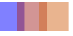
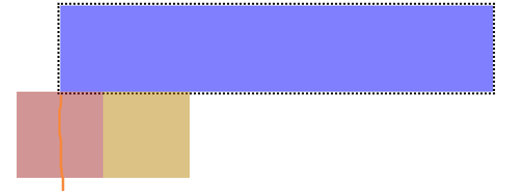
负的margin值在页面中是如何计算的
这里仅讨论margin-left与margin-right,然后这两个类似,下面就以margin-right为例:
正的margin-left就是使元素根据容器(或其他元素)的右边缘为基准线向左移动多少:

负的margin-left就是基准线还是一样,只是变成了向右移动:
.outer{
    width: 500px;
    height: 100px;
    border: 1px dotted black;
    margin: auto;
}
.item{
    float: left;
    margin-left: -100px;

    width: 100px;
    height: 100px;
    opacity: 0.4;
}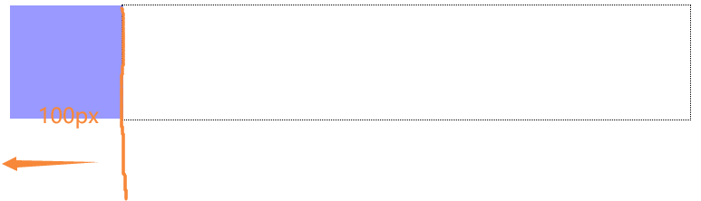
到这里都是比较基础的内容,这里需要注意这个基准线,先记着这个,后面讲圣杯布局的时候会更好理解。
讲一讲浮动
先看下面的布局:
	<body>
		<div class="outer">
			<div class="center"></div>
			<div class="left"></div>
			<div class="right"></div>
		</div>
	</body>
	<style>
		.outer {
			width: 500px;
			height: 100px;
			border: 3px dotted black;
			margin: auto;
		}
		.center {
			float: left;

			height: 100px;
			width: 300px;
			background-color: blue;
			opacity: 0.5;
		}
		.left {
			float: left;

			height: 100px;
			width: 100px;
			background-color: brown;
			opacity: 0.5;
		}
		.right {
			float: left;

			height: 100px;
			width: 100px;
			background-color: darkgoldenrod;
			opacity: 0.5;
		}
	</style>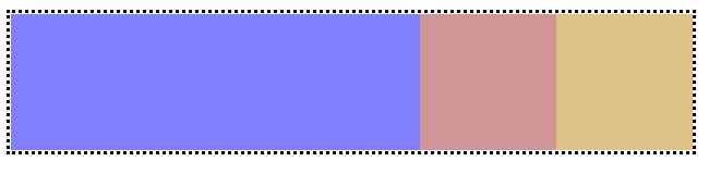
这就是浮动,这里注意是向左浮动的,简单来说就是各个元素按照排列顺序疯狂往左边挤就对了。
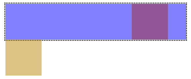
如果我们将center的宽度设大,那么其他两个元素会被挤下去:
.center {
    float: left;

    height: 100px;
    width: 500px;  /* 这里 */
    background-color: blue;
    opacity: 0.5;
}
这里后面两个元素也是一直在往左挤的,甚至我们可以理解为下方的左边缘与上方的右边缘是一条线:
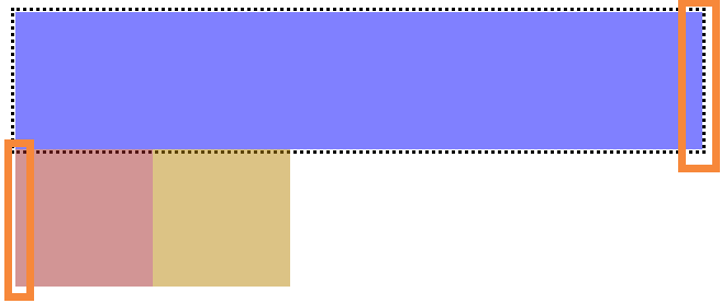
浮动+margin负边距
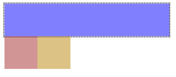
结合上面的知识,我们对下方两个元素块设置负的margin,注意这里父容器以及被挤满了(width:100%),所以这两个元素的margin-left与margin-right都是以上面的右边缘为基准线进行移动的。
为left元素添加一个负边距:
.left {
    float: left;

    margin-left: -150px;  /* 这里 */
    height: 100px;
    width: 100px;
    background-color: brown;
    opacity: 0.5;
}
再次提醒:这里因为父容器被center元素给挤满了,同时center设置的是float: left,所以可以理解为父容器的右边缘还剩下无限小的一条线的空间,而此时为left元素设置margin的话就是以这条线为基准进行移动的。
补充:
如果margin移动的距离小于自身宽度,元素是以下方的基准线来进行移动的,因为之前也讲过下方的基准线上上方的基准线其实可以理解为一条线,这也非常容易理解,并且圣杯布局并不会用到这个补充,这只是为了让你更加理解浮动配合负边距的效果:
margin-left: -50px时:
更灵活一点,如果设置把所有浮动设置为right,基准线变化如下:
<body>
    <div class="outer">
        <div class="center"></div>
        <div class="left"></div>
        <div class="right"></div>
    </div>
</body>
<style>
    .outer {
        width: 500px;
        height: 100px;
        border: 3px dotted black;
        margin: auto;
    }
    .center {
        float: right;

        height: 100px;
        width: 500px;
        background-color: blue;
        opacity: 0.5;
    }
    .left {
        float: right;

        margin-left: -50px;
        height: 100px;
        width: 100px;
        background-color: brown;
        opacity: 0.5;
    }
    .right {
        float: right;

        height: 100px;
        width: 100px;
        background-color: darkgoldenrod;
        opacity: 0.5;
    }
</style>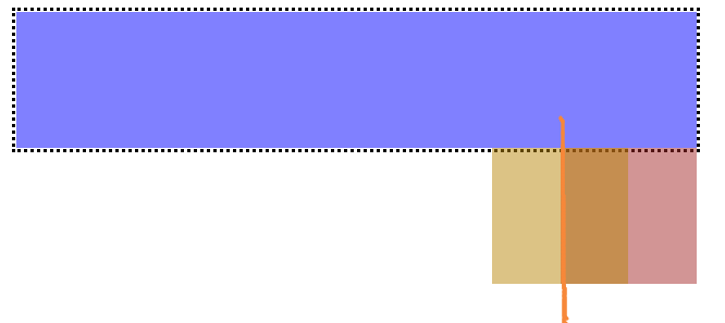
圣杯布局的实现
所以,接下来就非常简单了:
- 有一个BFC父容器,同时设置padding为左右两栏预留位置;
- center在最前面;
- center挤满整个父容器;
- 使用margin将left与right移动一定位置;
- 使用position相对定位调整位置;
当然,这里父容器的宽度并不是固定的,本来就要做响应式的嘛,上面的代码固定宽度只是为了更好地作图以及方便大家理解,所以下方的代码上上面地代码还是有一些出入的:
.outer {
    height: 100px;
    padding-left: 100px;  /* 左右两栏预留位置; */
    padding-right: 200px;
}

.left {
    position: relative;
    left: -100px;

    float: left;
    margin-left: -100%;
    width: 100px;
    height: 100px;
    background-color: blue;
    opacity: 0.5;
}

.right {
    position: relative;
    left: 200px;

    float: right;
    margin-left: -200px;

    width: 200px;
    height: 100px;
    background-color: brown;
    opacity: 0.5;
}

.center {
    float: left;

    width: 100%;
    height: 100px;
    background-color: darkgoldenrod;
    opacity: 0.5;
}为了大家更好的理解,下方为无相对定位的效果:

添加相对定位后的效果:

双飞翼布局
双飞翼布局相对于圣杯布局来说,左右位置的保留是通过中间列的 margin 值来实现的,而不是通过父元素的 padding 来实现的。本质上来说,也是通过浮动和外边距负值来实现的。
这里就不过多赘述,可以查看圣杯布局的实现:
双飞翼布局代码如下:
.outer {
  height: 100px;
}

.left {
  float: left;
  margin-left: -100%;

  width: 100px;
  height: 100px;
  background: tomato;
}

.right {
  float: left;
  margin-left: -200px;

  width: 200px;
  height: 100px;
  background: gold;
}

.wrapper {  /* 这个作为сenter的父容器是为了方便设置宽度为100%,否则只用一个元素设为100%再加上margin会把父容器撑大 */
  float: left;

  width: 100%;
  height: 100px;
  background: lightgreen;
}
/* 将margin与width:100%分开写才行 */
.center {
  margin-left: 100px;
  margin-right: 200px;
  height: 100px;
}
最后,希望面试问到这道题[滑稽]